UI / UX Design
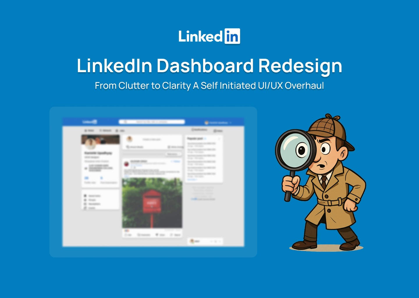
Linkedin Redesign
A clean and modern redesign of LinkedIn’s interface, featuring a structured card-based layout, improved hierarchy, and streamlined interactions to enhance usability and visual consistency across the platform. Check full CaseStudy -https://www.behance.net/gallery/232045301/Linkedin-Redesign
Year :
2024
Industry :
Tech
Client :
Personal Project
Project Duration :
1 weeks
Problem :
In the world of interface design, achieving a balance between visual clarity and functional depth is often a challenge. Many redesigns either lean too heavily into minimalism sacrificing information accessibility or become cluttered with excessive elements that hinder usability. Crafting a layout that feels fresh, intuitive, and professional without overwhelming the user required a thoughtful approach to hierarchy, spacing, and content flow, ensuring the platform remains approachable for both casual browsers and power users.
Solution :
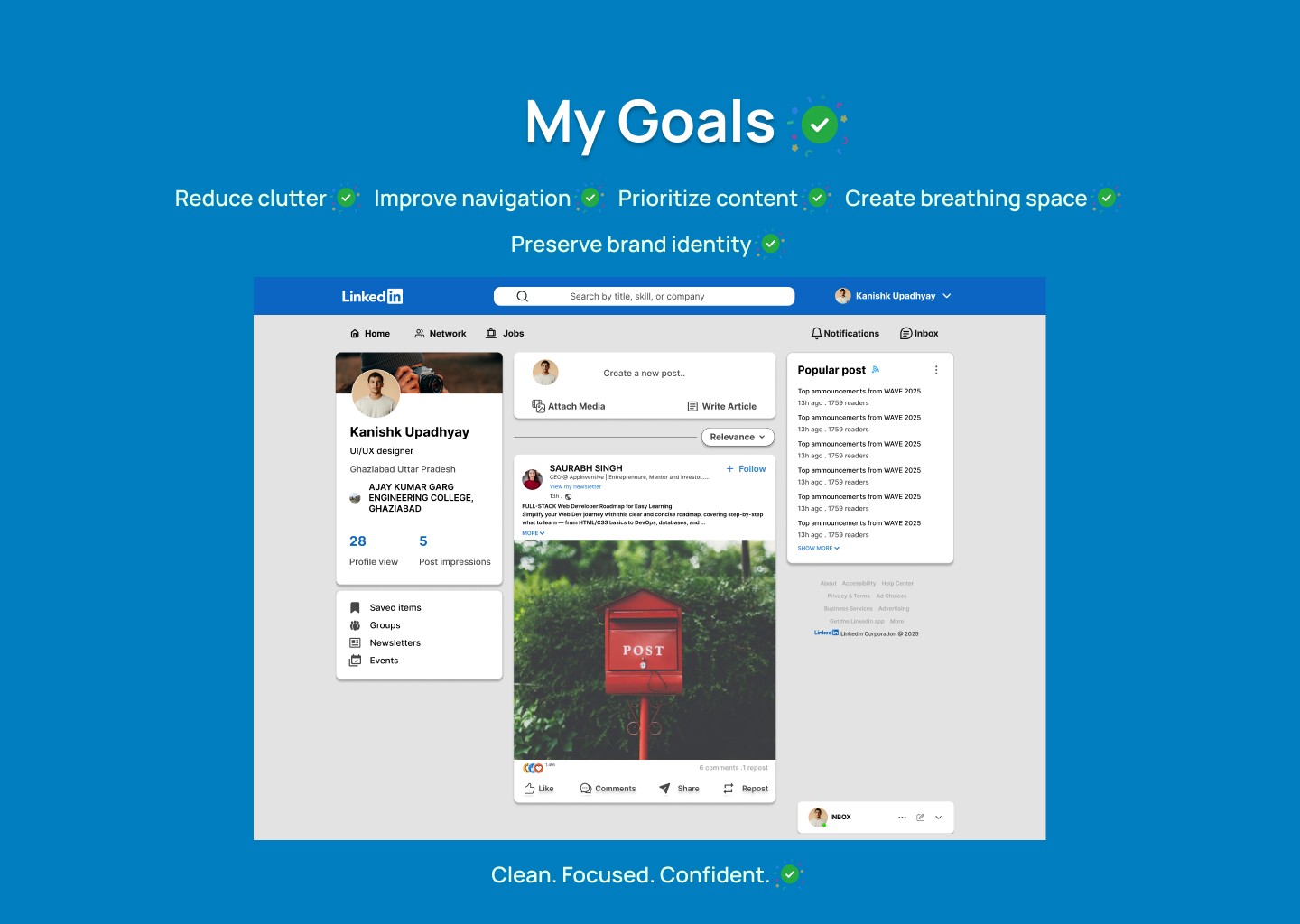
This project introduces a thoughtfully restructured LinkedIn interface, designed to balance professional clarity with a refreshed visual identity. By leveraging clean layouts, subtle shadows, and modular card components, the design creates a sense of order and depth without overwhelming the user.
The restrained color palette and emphasis on white space support a minimalist yet approachable aesthetic, while the refined UI elements improve usability. This approach ensures the interface remains adaptable and future-ready across both desktop and mobile experiences.
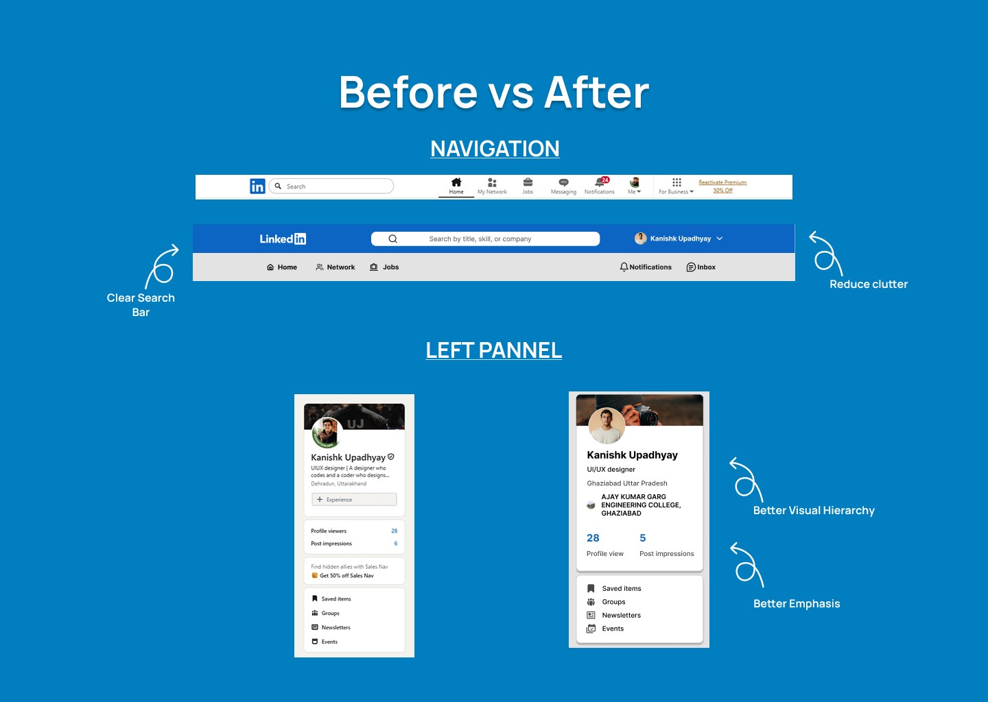
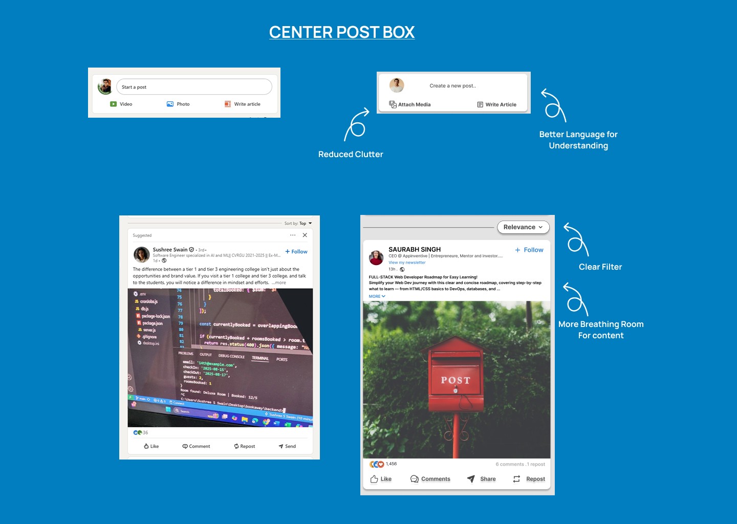
Challenge :
One of the main challenges was achieving a harmonious balance between simplicity and functionality. The interface needed to feel modern and clean, yet robust enough to present diverse user data without appearing cluttered. Designing a layout that felt dynamic and engaging, while maintaining visual order and ease of use, required careful attention to spacing, hierarchy, and consistency across all components.
Summary :
"LinkedIn Remaster" is a user interface redesign project that reimagines the professional networking experience through a clean, modular layout and streamlined interactions.
By focusing on intuitive navigation, clear visual hierarchy, and modern UI patterns, the project introduces a refined design language that enhances usability while maintaining a professional and familiar identity.

UI / UX Design
Linkedin Redesign
A clean and modern redesign of LinkedIn’s interface, featuring a structured card-based layout, improved hierarchy, and streamlined interactions to enhance usability and visual consistency across the platform. Check full CaseStudy -https://www.behance.net/gallery/232045301/Linkedin-Redesign
Year :
2024
Industry :
Tech
Client :
Personal Project
Project Duration :
1 weeks
Problem :
In the world of interface design, achieving a balance between visual clarity and functional depth is often a challenge. Many redesigns either lean too heavily into minimalism sacrificing information accessibility or become cluttered with excessive elements that hinder usability. Crafting a layout that feels fresh, intuitive, and professional without overwhelming the user required a thoughtful approach to hierarchy, spacing, and content flow, ensuring the platform remains approachable for both casual browsers and power users.
Solution :
This project introduces a thoughtfully restructured LinkedIn interface, designed to balance professional clarity with a refreshed visual identity. By leveraging clean layouts, subtle shadows, and modular card components, the design creates a sense of order and depth without overwhelming the user.
The restrained color palette and emphasis on white space support a minimalist yet approachable aesthetic, while the refined UI elements improve usability. This approach ensures the interface remains adaptable and future-ready across both desktop and mobile experiences.
Challenge :
One of the main challenges was achieving a harmonious balance between simplicity and functionality. The interface needed to feel modern and clean, yet robust enough to present diverse user data without appearing cluttered. Designing a layout that felt dynamic and engaging, while maintaining visual order and ease of use, required careful attention to spacing, hierarchy, and consistency across all components.
Summary :
"LinkedIn Remaster" is a user interface redesign project that reimagines the professional networking experience through a clean, modular layout and streamlined interactions.
By focusing on intuitive navigation, clear visual hierarchy, and modern UI patterns, the project introduces a refined design language that enhances usability while maintaining a professional and familiar identity.